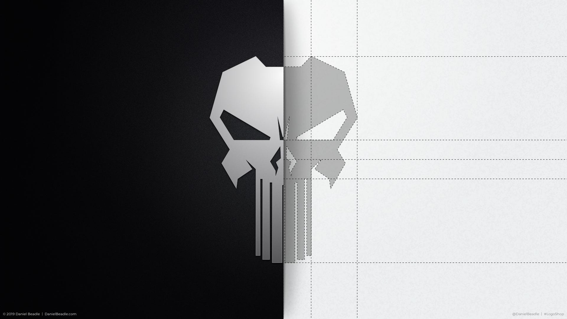
LogoShop Part 8: The Punisher
Creating a bulletproof logo for Marvel’s most ruthless vigilante.
This is part of a blog series on logo design. Read additional articles on DC Comics, the Justice League, Superman, LexCorp, Nightwing, Wonder Woman, Green Lantern, Coca-Cola, Pepsi, and Adidas.
Typically, heroes are driven by a desire to do good in the world. They save lives, protect the innocent, and strive to make the world a safer place.
The Punisher is not such a character.
The Punisher, also known as Frank Castle, is driven by hatred. He hates criminals with such a passion that he has vowed to exterminate them one by one. Saving lives and protecting the innocent is incidental.
While most comic book heroes are reactive (they wait for trouble to strike before taking action), the Punisher is proactive, taking out career criminals before they get another chance to cause harm. As such, he’s essentially a serial killer with a moral compass.
And speaking of his black-and-white morality, the Punisher’s costume is just as stark, often appearing as an all-black tactical outfit with a large white skull emblazoned on his torso. The Punisher’s skull brands him as a grim reaper, inspiring fear in all who see it. It also draws fire to his chest, which is the most heavily armored part of his costume.
So, shouldn’t the Punisher have a logo that’s truly bulletproof? Let’s see what we can do.
Disclaimer: The LogoShop series is entirely speculative, reimagining popular brands and exploring the creative process behind them.
The Background
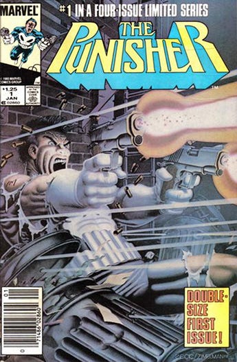
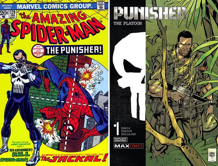
The Punisher initially appeared as an antagonist to Spider-Man in 1974, portrayed as a brutal vigilante on a mission to hunt down gangsters and criminals. His backstory was fleshed out in later issues, revealing that Frank Castle was a US Marine and Vietnam War veteran whose family was killed in the crossfire of a gangland shooting. He vowed to wage war on criminals, using his skills to compensate for a flawed justice system.
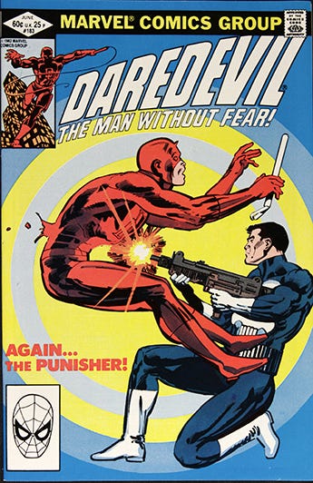
Due to the character’s popularity with readers, he made recurring appearances throughout the 1970’s and 80’s, teaming up with additional Marvel heroes. Writer and artist Frank Miller brought the Punisher into conflict with Daredevil during this time, contrasting the two character’s opposing views on criminal justice.
The Punisher would eventually get his own solo series in 1986, enjoying a wave of popularity that took him into the mid-90’s. The broader comics landscape was trending towards dark anti-heroes at the time, so the Punisher was in good company.
By the late 1990’s, sales started to drop off, and the Punisher went through a series of unsuccessful revivals. It wasn’t until writer Garth Ennis re-launched the character in 2000 that he started to gain traction with audiences again. Ennis took the Punisher back to basics, separating him from the superhero community, and pitting him against the mob. This take on the character eventually inspired the 2004 movie with Thomas Jane in the lead role.

In the time since, the Punisher has enjoyed varied success. His on-screen appearances were lacking, until Marvel introduced him as an antagonist in their ongoing Daredevil series in 2016, and later as the protagonist of his own series the following year.
With every new appearance, be it in comics or on screen, the Punisher’s look is revamped and reimagined, applying his signature skull in new and interesting ways.
The Problem
In the beginning, the Punisher’s costume was in line with most comic book characters, portrayed as a spandex-like suit with contrasting boots and gloves. His skull insignia covered his chest, with teeth that doubled as ammunition clips attached to his belt. Slight variations of his costume were made as the plot dictated, sometimes adding a headband or a trench coat for a more covert look, or opting to go sleeveless in warmer climates.
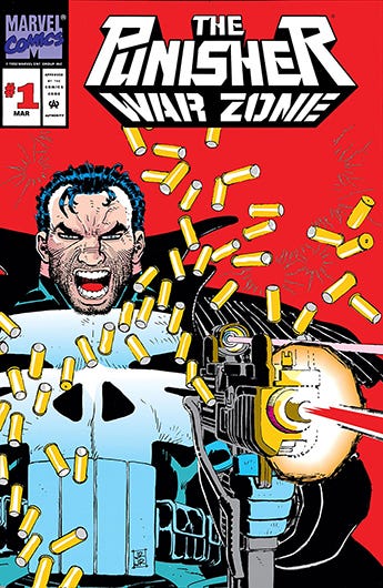
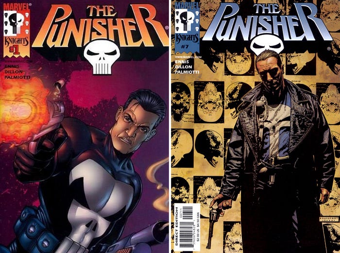
In the 2000 series, illustrated by Steve Dillon, the white boots and gloves were dropped, in favor of an all-black outfit with white skull. The cover art to this series, as illustrated by Tim Bradstreet, gave the Punisher a more gritty, down-to-earth look, showing him in a leather trench coat and a Punisher T-shirt.
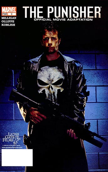
The latter outfit was used in the 2004 film, which redesigned the Punisher skull to have much larger eyes and long, thin teeth. The film also showed the Punisher skull applied directly to body armor, a look that would be used in every subsequent live-action appearance.
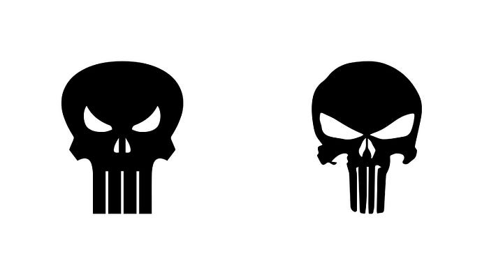
The Punisher skull is a lot like Batman’s bat symbol. Even though there’s a classic trademarked version, there are dozens, if not hundreds of variations used across every appearance. Every new comic book series, every new film or TV show, and every new title design features an entirely new logo. This brand inconsistency is an epidemic with comic book characters, and especially so with the Punisher.
Unfortunately, the Punisher’s classic logo isn’t particularly threatening. And the 2004 movie logo, which has since gained mainstream popularity, seems like an overcorrection into horror territory. Plus, the asymmetric look doesn’t seem in line with a detail-oriented military man like Frank Castle. It’s something I’d expect to see on a goth, not a soldier.
The Solution
So what should the Punisher skull look like? It should be threatening, but not creepy. It should have glaring eyes, and a few long teeth that extend into the utility belt. It also should look like body armor, following the lines of torso, and befitting a man with Frank Castle’s personality and background.
I initially took on this project because I couldn’t find a Punisher logo that had all these elements. The skull used in the Netflix series, however, made for a great foundation for what I had in mind.
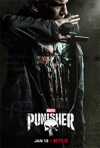
I took the basic outline and cleaned it up, transforming it from dripping paint applied to body armor into the armor itself. I sharpened the cheek bones to follow the rib cage, and shaped the eyes to underline the pectorals, similar to Steve Dillon’s version. I included the top center notch, since it created a vest-like quality. Finally, I extended the teeth into the belt, and shaped them to create a subtle sense of depth.

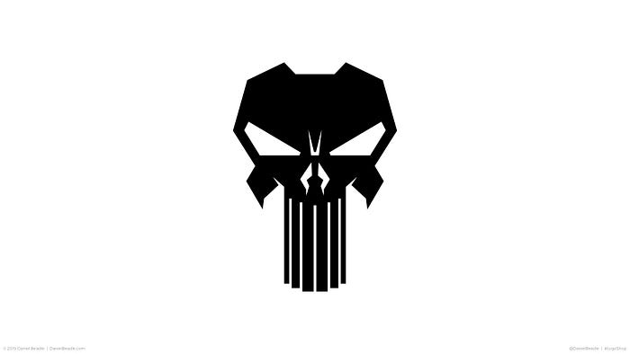

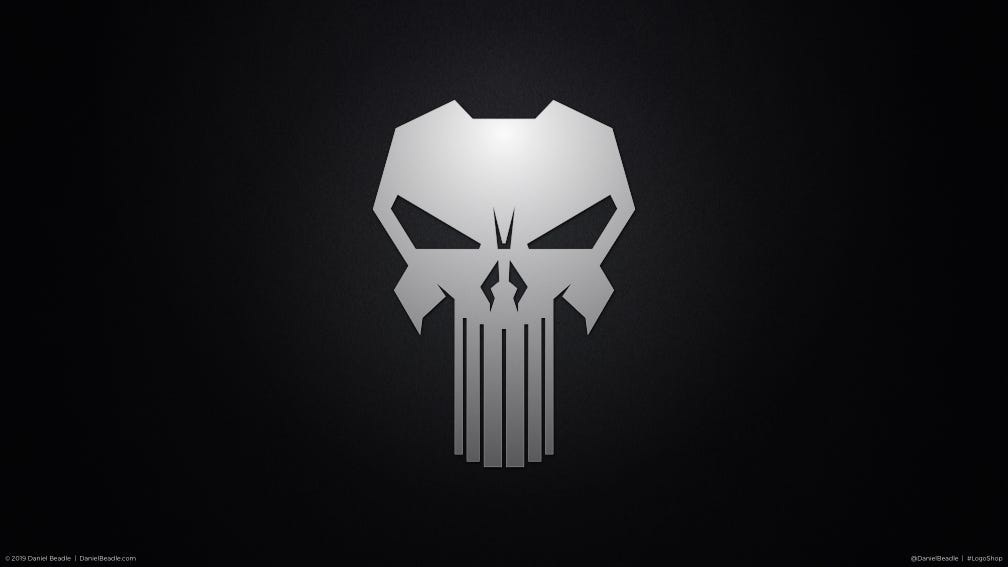

Mission accomplished. A symbol that maintains the defining characteristics of its past, while incorporating some of the more recent modifications of popular adaptations.
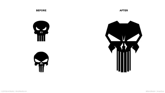
That’s it for this installment of LogoShop, and for my take on comic book logos. If you’re a Punisher fan, go ahead and download a pack of wallpapers from this article here.
Next time, I’ll reveal the fatal flaw in a world-famous brand, and see what I can do to fix it. Join me as I refine the logo for Coca-Cola. You’re going to love it.
Hi, I’m Daniel Beadle, writer, artist, and design consultant. Follow me and my work at DanielBeadle.com.


