LogoShop Part 5: Nightwing
Creating a definitive insignia for Batman’s first sidekick.
This is part of a blog series on logo design. Read additional articles on DC Comics, the Justice League, Superman, LexCorp, Wonder Woman, Green Lantern, the Punisher, Coca-Cola, Pepsi, and Adidas.
We all think of Batman as a loner. A dark knight waging a solitary war on crime. The truth is, Batman didn’t even make it a full year after his debut before teaming with young Dick Grayson, better known as Robin.
Robin was designed as an audience surrogate, the Watson to Batman’s Sherlock Holmes. It also didn’t hurt that he embodied the primary Batman’s target demographic at the time.

But as the years passed and Robin grew up, he found himself having adventures separate from his mentor. And as his role changed from Batman’s sidekick to leader of the Titans, a rebrand seemed appropriate.
And so Robin became Nightwing.
Only problem was, he never really settled on a definitive insignia. Let’s help him out with that.
Disclaimer: LogoShop is a strictly for-fun side project of mine. I’m in no way affiliated with DC Comics or Batman.
The Background
Robin, also known as Dick Grayson, first appeared in 1940 as Batman’s kid sidekick. Batman and Robin were virtually inseparable in the decades that followed.
In 1967, Robin joined other sidekicks to form the Teen Titans, something of a junior Justice League. By the end of the 1960’s, Batman returned to his darker roots as more of a solo crimefighter, and the Batman and Robin team-ups became less frequent.
By the 1980’s, Robin became the leader of the Titans, and was rebranded as Nightwing. (And because some writers were so nostalgic about the Batman and Robin pairing, they made sure Batman hired a replacement around the same time.)
Nightwing’s first costume, as it appeared in 1984, had a distinctly disco vibe, with a high collar and gold fringe, the latter of which was meant to look like feathers. And rather than a chest insignia, he instead opted to show his bare chest.

But in the years that followed, Nightwing went from having probably the worst costume in comics to one of the best.
By the time Nightwing headlined his own limited-series in 1995, his look was redesigned as a black bodysuit with a blue accent across his chest and down both arms. The latter element emphasized his arms (AKA wingspan), and gave Nightwing a very distinct silhouette. It was a much needed and well-deserved evolution of the character’s brand, completing his journey from light-hearted sidekick to urban ninja.

This costume became Nightwing’s most enduring look, as he wore it for the duration of his ongoing series, from 1996 to 2009. The main issue with this costume, however, was the lack of a meaningful chest emblem. Instead, he sported a V-shaped design element with two inward-facing cuts. It seemed like a missed opportunity to at least add a bird-like shape the center of the “V.” This was especially glaring, since the title design of the series included an abstract bird shape standing in for the “T” in Nightwing.
This issue would be addressed in Nightwing’s 2011 series, where he wore a red chest emblem with a point at the top, similar to the aforementioned title design. In 2016, his emblem would be returned to blue, and a beak was added to the top. In both cases, the stripes running down each arm were omitted.

In keeping with Nightwing’s costume, all of these chest designs were very minimal, merely hinting at the shape of a bird’s wings without really embracing it.
The Problem
Dick Grayson is one of the oldest comic book characters still in use today. He’s also been in the role of Nightwing for close to 40 years. For a superhero with that much longevity, he deserves a consistent and strong brand identity.
I’ve reviewed Nightwing’s comic book evolution, but I left out his adaptations in other media, where he’s come the closest to having a solid, free-standing logo. One of his most prominent roles was in the final season of Batman: The Animated Series (rebranded to The New Batman Adventures), wherein he wore a bird insignia that extended up to his shoulders. It was a natural way to bring in the “V” shape from the comics, with the introduction of a distinct bird emblem. Unfortunately, it left off one of the more distinct design elements, the blue stripes running down each arm.

In the popular TV series Young Justice about a decade later, Nightwing wore an all-black tactical costume with a small bird emblem on his chest. This, I think, minimizes his branding too much, and again jettisons the most distinct aspect of the comic book costume, leaving him with a rather bland silhouette.
The Solution
My task was to bring together the best elements of every symbol associated with Nightwing into a single, distinct and powerful insignia.
I started by adapting the mark used in the title of Nightwing’s ongoing series. Unfortunately, it wasn’t bold enough, and looked a little too similar to the Bat symbol. I reasoned that Nightwing would want some distance from his mentor’s brand. It also looked nothing like a bird, so I started over.

For my second attempt, I decided to marry Nightwing’s most enduring costume design with the bird logos introduced in the two animated series. I took a “V” shape, and added in the bird’s head and beak. I then cut out portions of the “V” to create feathers. Finally, to pull in another element from Nightwing’s longest-running costume design, I added wing tips that pointed inward. Taken in isolation, it creates a 3D, wing-flapping effect.


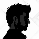
To fully appreciate how this logo works on Nightwing’s costume, I mocked up a version applied to the character’s silhouette. Here, I brought back his arm stripes, showing how they extend from the chest emblem, further emphasizing his brand.


Now an enduring character has a distinctive mark to call his own. As with all logos in this series, the driving principle is to build on, and enhance the best elements that came before. And with any long-running property, that’s the surest way to create brand continuity, and the continued loyalty of the audience.

That’s all for now. If you want desktop wallpapers from this article, you can download them here. And as a bonus, I also created a few Batman designs for your desktop, which you can download here.
Join me next time, when I’ll take a look at another pop-culture icon: Wonder Woman. See you then.
Hi, I’m Daniel Beadle, writer, artist, and design consultant. Follow me and my work at DanielBeadle.com.