LogoShop Part 1: DC Comics
Refining the oldest comic book brand.
This is part of a blog series on logo design. Read additional articles on the Justice League, Superman, LexCorp, Nightwing, Wonder Woman, Green Lantern, the Punisher, Coca-Cola, Pepsi, and Adidas.
Have you ever seen a new logo and thought it didn’t look quite right? I sure have. As a designer and comic book fan, I’ve spent my life studying art and composition. And when a brand I know and love rolls out a redesigned logo, I’m going to have a few thoughts.
But. I won’t make a criticism without offering a solution.
Welcome to LogoShop, a series where I’ll be refining or reimagining the logos behind some of the most iconic brands (with a special focus on comic brands for the first installments).
I’ve worked with a wide variety of brands in my time as a designer, and logos have always been of particular interest to me. In this series, I’ll be taking a closer look at some of my favorite brand identities, and look for opportunities to make them better while preserving their integrity.
Today, we’ll take a look at DC Comics, the oldest comic book publisher in the US. DC has a special place in my heart, because I spent most of my teenage years completely obsessed with their comics. Let’s take a look at how their logo as evolved, and where it stands today.
Disclaimer: This series is has not been endorsed or solicited by any of the brands I’ll be discussing, and is purely a speculative exercise.
The Background
Comic book publisher logos are incredibly important. They appear on every cover, every piece of merchandise, and now, every movie that that company puts into the world.
DC Comics has been around since 1934, using the initials of their flagship title, Detective Comics, as the name of their company. The first version of their logo appeared on comic book covers in 1940.

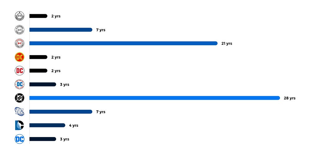
Over the course of the next 80 years, the logo went through 10 different incarnations. When you look at the timeline, it becomes clear that each major revision was took a few tries to get it right before crafting a version that would work in the long term.

The early 1970s was such a time, when DC experimented with a few different variations in the span of four years. Finally, in 1976, new publisher Jenette Kahn commissioned designer Milton Glaser to design a new identity. Glaser brought together many of the elements that were floating around at the time — block letters, stars, a circular container — into a simple, bold, and succinct mark.
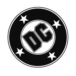
This logo, referred to as the DC Bullet, premiered in 1977, and would be DC’s primary logo for the next 28 years, surpassing every other mark they had before or since. For this reason, elements of this logo are most closely associated with DC as a brand, especially for those of us who read their comics before 2005.
So what toppled DC’s most enduring logo?
Movies.
In 2005, DC made the decision to release one major motion picture a year, culled from their extensive library of characters. They started with their most bankable star, Batman.
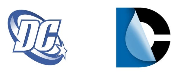
Batman Begins was released in the summer of 2005, and was the first film to feature DC’s fresh new logo, the DC Spin. It didn’t last long. Just seven years later, they replaced it with the DC Peel, a 3D reimagining that was a clever nod to the dual identity of DC’s many characters. The problem? While it worked well in motion and in full color environments, it didn’t have a decent silhouette. It lacked the versatility needed for a brand that touched so many different products.
And so, in 2016, DC went back to basics. They essentially revived one their logos from 1972, before the Bullet, using block letters and a circle enclosure. The silhouette was clear.
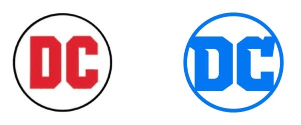
As an outsider, I suspect this rapid succession of redesigns had everything to do with new media. They pivoted every few years to create a logo that worked not just in print, but on film, TV, websites, sub brands, social media, phone screens, and on and on. It’s undeniably a difficult time for large companies to cement their identity, with technology changing so quickly. In my view, simplicity always wins. The most timeless brands are uncomplicated. And that’s where DC ultimately ended up.
But did they lose something along the way?
The Problem
When I first saw the latest DC logo in 2016, I had mixed feelings. I was already troubled by the fact that their logo kept changing every few years. But I was encouraged by the return of the block letters and the circular enclosure that defined the most enduring, and in my eye, the most recognizable DC logo.
I just felt that something was missing. The logo seemed like an overcorrection, like they went too far back in time, and left out a defining feature. Let’s talk about stars.

DC first introduced stars into their logo in 1974, in the context of their tagline, “The Line of DC Super Stars.” It’s been a recurring element in their titles, from the Justice League to All Star Comics. Even the most recent Justice League movie snuck a star cutout into the title. To me, DC is true Americana, and the star makes that clear. DC is a classic US brand like Coca-Cola and Louisville Slugger. Superman is the quintessential American hero, and until recently, Wonder Woman wore elements of our flag as part of her costume. The omission of the 5-point-star from the DC logo just seems wrong.

Another nitpick I have with DC’s current logo is the lettering. The letters seem jagged and chaotic. Unfinished. The suggested serif on the D extends well beyond the boundaries of the circle. And the serif on the C is crooked and broken. Also, I feel that there’s a missed opportunity for the letters to mirror each other.
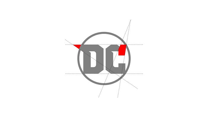
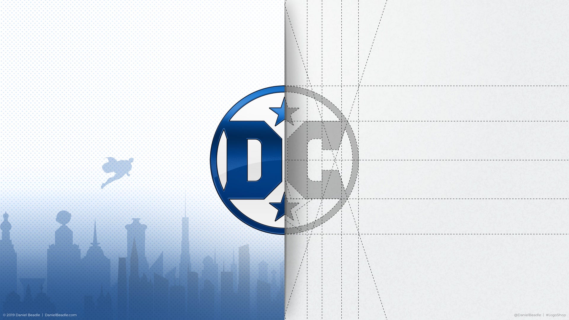
Because DC is a brand that I love, I felt compelled to take their newest logo into the Shop.
The Solution
The solution was obvious to me. I started with the letters, making sure the outer points of each touched the outer ring of the circle. I reflected elements of each letter to create a clear symmetry between the “D” and the “C.”
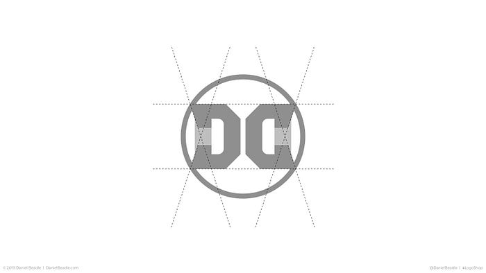
The circle created negative space that could easily fit a star above and below the letters, bringing back an element that defined the logo for so long. My early attempts included an inverted star at the top, but I ultimately decided against it (namely to avoid any suggestions of Satanism, naturally).
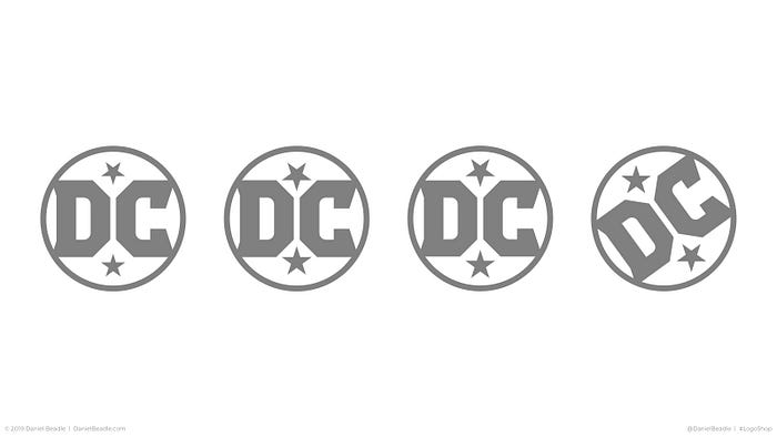
I played with the idea of rotating the mark, in a style similar to the DC Bullet, but I felt keeping it vertical drew attention to the symmetry of the whole. Finally, I made sure the angle of the outer diagonals (seen most clearly on the “C”) matched the diagonal lines of the stars.


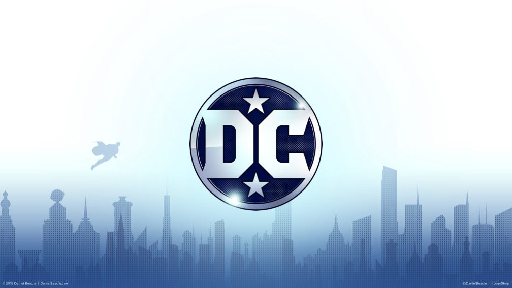
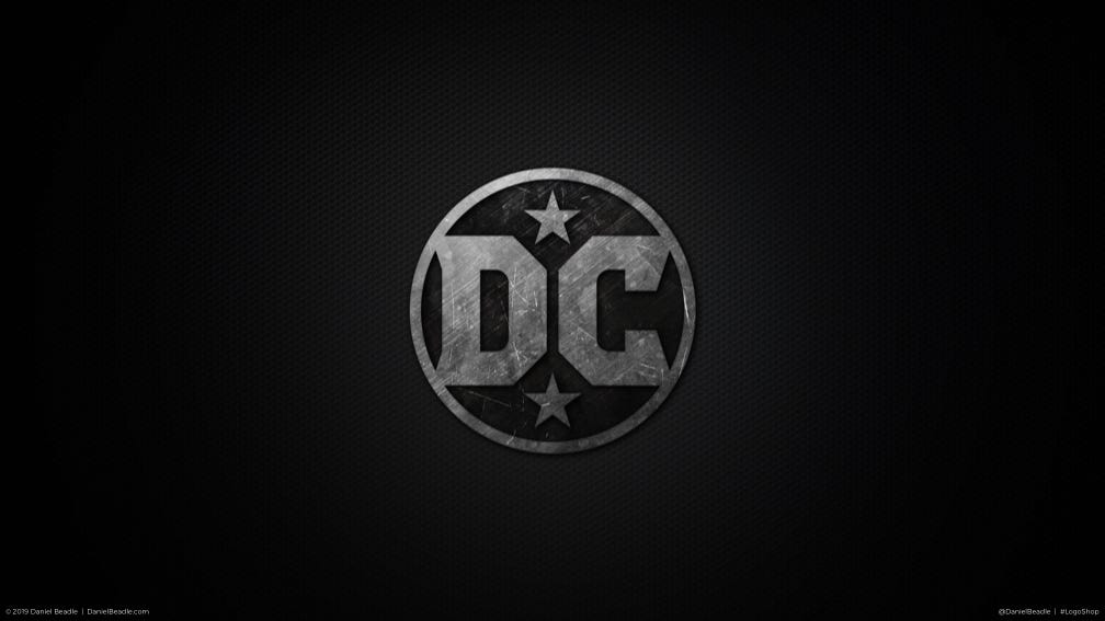
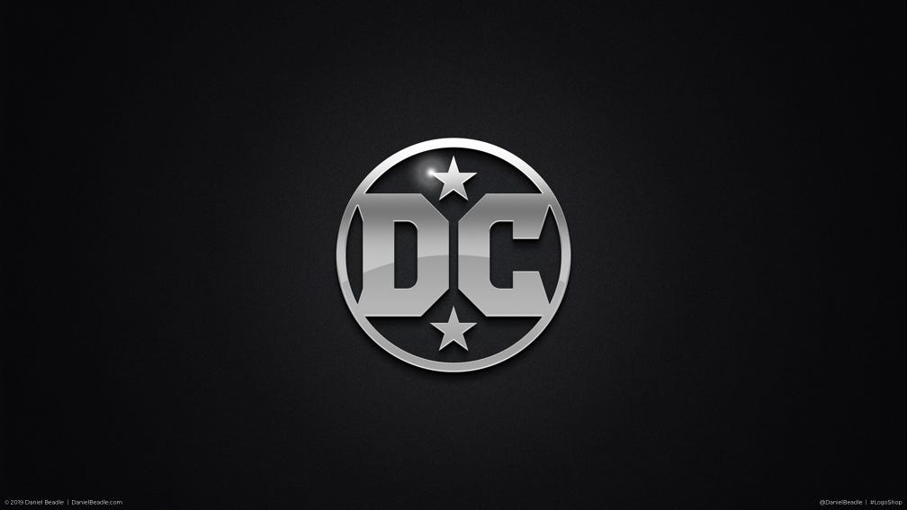
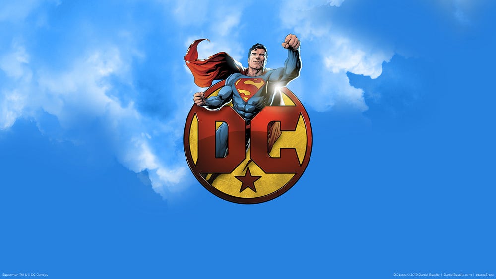
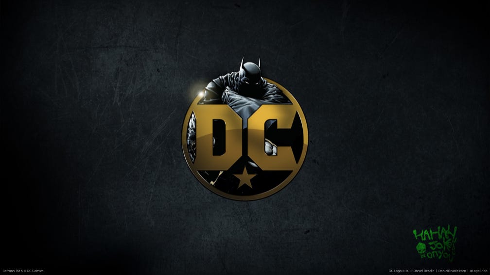


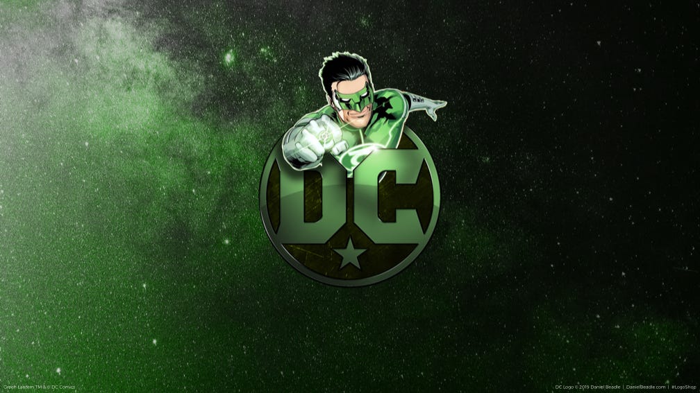
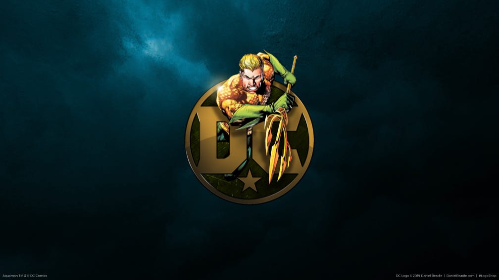

With a little nudge, the logo has a distinct look that builds on its long history while keeping it simple enough for its endless applications. Seems like something that could last a while.
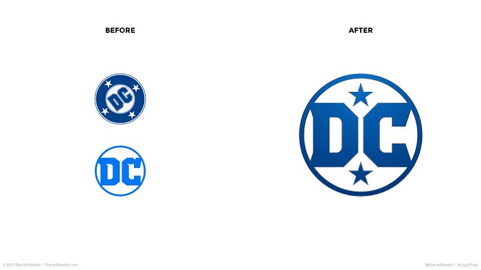
As a side note, I always prefer brand evolutions to complete redesigns, as it builds on what came before, and helps brand continuity in the eyes of customers.
If you like what you see, go ahead and download a complete set of DC wallpapers here, and a complete set of the character wallpapers here.
That does it for this installment of LogoShop. Join me next time, when I’ll fix up the logo for DC’s flagship team, the Justice League.
UPDATE: After more research, I found out that when DC Comics redesigned their logo in 2005 to the Spin, they filed a lawsuit against DC Shoes to prevent brand confusion. (DC Shoes has a logo with their initials and a seven-point star.) Normally, companies in separate industries don’t have to worry about this, but because DC Comics also makes and licenses clothing for their properties, it seemed justified.
Unfortunately, the lawsuit revealed that DC Comics had let their trademark on the Glaser logo and its elements expire by the time they redesigned their logo in 2005. As such, DC Shoes was able to countersue, claiming that it was in fact DC Comics that was infringing on DC Shoes’ brand identity. DC Comics’ parent company, Warner Bros., then had to pay a significant amount of money to keep using the new DC Comics logo.
In 2009, DC Entertainment was created to manage the intellectual property of DC Comics, and soon redesigned their logo to the Peel (mentioned above), removing all elements that brought them into conflict with DC Shoes.
DC Entertainment simplified their logo in 2016 as an attempt to regain their legacy, but unfortunately, they couldn’t legally use stars and, presumably, reflected letters. Which means that the logo I created above would likely be unusable. So let’s mark this one up as pure fantasy.
Hi, I’m Daniel Beadle, writer, artist, and design consultant. Follow me and my work at DanielBeadle.com.
